Project Overview
FITGYMM is a fitness center offering a range of classes and personal training services. The goal for the website was to create a clean, simple, and welcoming platform that showcases all FITGYMM has to offer. The website includes six key pages: Home, Classes, About, Review, FAQ, and Contact, each designed to provide clear, easy-to-understand information for users.
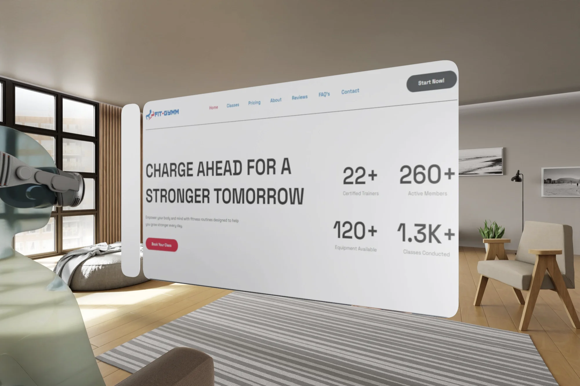
Apple Vision Pro View:

Objectives
The goal was to create a website that shows FITGYMM’s strengths. We wanted the website to be easy for visitors to find information, sign up for memberships, and learn about the gym’s services. The website needed to feel professional but still friendly, with a focus on what makes FITGYMM stand out.
Challenges
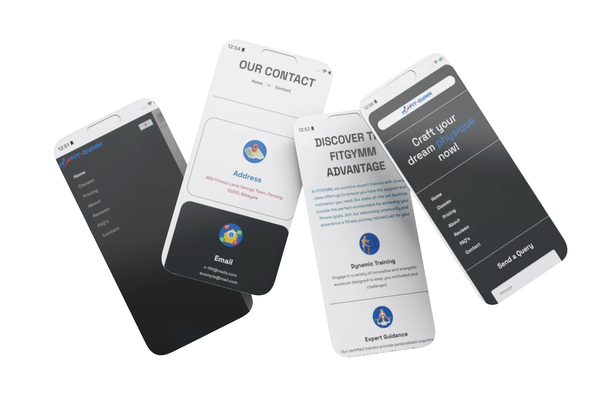
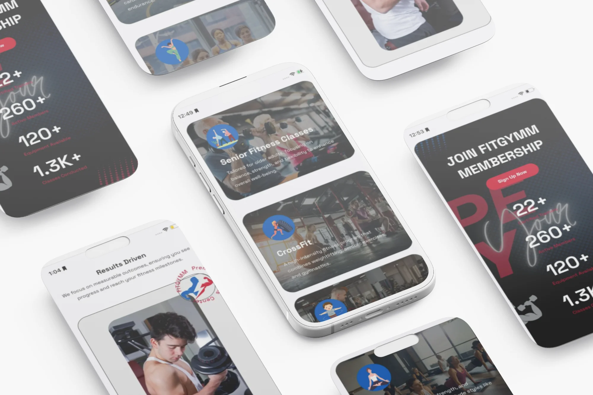
One challenge was making the website clear and simple while still showing all the information. We needed to highlight services like personal training, group classes, and gym memberships without confusing visitors. Another important challenge was to make sure the website works well on mobile phones and computers.

Solutions
Each of the six pages was carefully structured to deliver the right information while keeping the design clean and simple:
Home Page: The Home page has a welcoming hero section with a message like: “Charge Ahead for a Stronger Tomorrow”, It includes key buttons for exploring classes or signing up for memberships. The layout is designed to make a strong first impression while guiding visitors to other pages easily.
Classes Page: This page lists all the available fitness classes, like strength training, yoga, and HIIT. Each class has a short, easy-to-read description, showing what it offers and how it benefits different fitness levels.
About Page: The About page shares FITGYMM’s mission and vision, along with the story of how the gym started. It’s written in a friendly tone, making it easy for visitors to understand the gym’s purpose and values.
Review Page: On the Review page, users can read testimonials from current members. The reviews highlight the positive experiences and successes of people who have trained at FITGYMM, creating trust and credibility.
FAQ Page: This page answers common questions like membership options, class schedules, and cancellation policies. The simple language makes it easy for users to find answers without feeling overwhelmed.
Contact Page: The Contact page provides the gym’s address, phone number, and a contact form. It makes it easy for potential members to get in touch for inquiries or support.

Results
The website launch was successful, with visitors appreciating the simple design and easy navigation. The gym has seen an increase in membership sign-ups, and more inquiries are coming through the contact form. The mobile-friendly design also ensures users can access the website from their phones, making it convenient for everyone.


